- Authors
-
capiqua
|
Neocities.org
an eAIDter
coh. coh. coh. maybe Neocities?
Sign up for the COH-D Prog to gain access to the Pre-Alpha Preview, Design Docs, Discussions with the Devs, Art Drops and more!
This is a paragraph! Here's how you make a link: Neocities.
Please note: Relic Ent.are still working on the game! It is still very early days in the development process, and while the build you will play is representative of the final game experience, just remember this is not final. This Pre-Alpha Preview is just an early look at what we have in store for the full single-player campaign. You may see or experience a bug here or there. …
Sign up for the COH-D Prog to gain access to the Pre-Alpha Preview, Design Docs, Discussions with the Devs, Art Drops and more! Please note: Relic Ent.still working on the game! It is still very early days in the development process, and while the build you will play is representative of the final game experience, just remember this is not final. This Pre-Alpha Preview is just an early look at what we have in store for the full single-player campaign. You may see or experience a bug here or there. …
This is a paragraph! Here's how you make a link: Neocities.
Here's how you can make bold and italic text.
Here's how you can add an image:

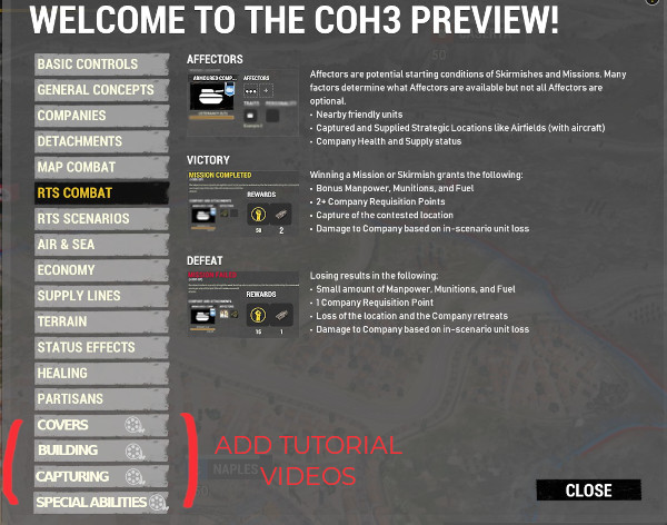
001.RTS-MAP. Tutorial: Yes, please!
+Suggestions: Pomogliano starter video tutorial. Is very heavy (3'30 ''), divide it into several videos (maybe 4 or
5 or 6 or more videos), construction, flanking, cover, special abilities, etc.
+10 or 15 seconds (approximately) each video. More time is very tire.
+To make it more attractive: give away rewards (second company slot, more started MU 1st RTS, more started FU 1st RTS), at finish last video.
+ (3'30'') infantry only. You also need tanks (perhaps for MP).
+ Video should be done when final icons have been implemented. In coh2 it was made in a beta.
+ The videos must be subtitled, otherwise it is totally useless for other language users.
002.RTS-MAP.Tutorial_history: How can a user watch the video tutorial again?.
We need a history of videos in the " ? ". Group Pomogliano tutorial videos Infantry into " ? " (maybe a tab).
003.Video-Cinemas: Starting missions the campaign is not subtitled. It is totally useless for other language users.
004.Speechs with subtitle: Since it will not be doubled to the languages of always. Subtitles the dialogues of the units, on the contrary it is totally useless for other language users.
005.RTS-MAP. Units cannot be routed as in coh2: Only goes from point A to ultimate point B.
006.RTS-MAP. COH3 pressing F1 or F2 or F3 does not focus the screen on the building. In coh2 if you press one of these keys twice quickly, the screen will focus on the selected building.
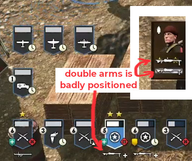
007.RTS-MAP.BUG.Double_Guns: Double guns is badly positioned. I hope this bug will not carry over during the whole useful life of coh3.
Please note: Relic Ent.are still working on the game! It is still very early days in the development process, and while the build you will play is representative of the final game experience, just remember this is not final. This Pre-Alpha Preview is just an early look at what we have in store for the full single-player campaign. You may see or experience a bug here or there. …
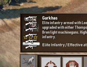
008.RTS-MAP.BUG.Gurkas_Multiple_Guns: Multiples guns is badly positioned.
009.RTS-MAP.ON_OFF:
+The difference between bazooka-on and bazzoka-off no differences.
+Tanks. I don't like how it was done in coh2. Maybe a standard for all factions.
+Healing. That's the idea, but the symbol forbidden off, maybe you should put another symbol like an x in red.
In short: Add red x symbol (or similar) to off icons.

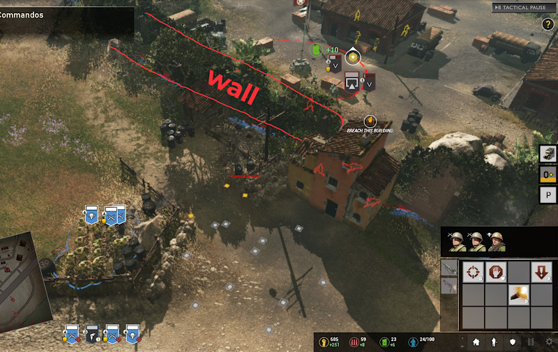
010.RTS-MAP.POMIGLIANO.Vision: User units firing through the wall of bushes. Suggestion: put vision blocker.
011.RTS-MAP.vehicle_repair_bar:
+Bar is always empty.
+Bar does not appear in the part of the shield line.
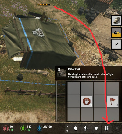
012.RTS-MAP.Building_bar: There should be a construction bar above the building icons on the base, as in coh2.
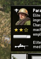
013.RTS-MAP.Health_bar: Is difficult to distinguish the health bar.
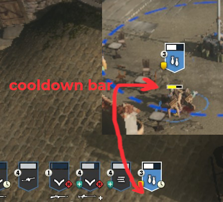
014.RTS-MAP.Cooldown bar:
+Hides units. suggestion: move the bar, a little, just stuck under the shield.
+Add another bar in the line of units icons.
015.RTS-MAP.Icon Techs no highlight: When I'm in a base build. Don't seen Icon Techs is highlighted.The highlighted icons are implemented in coh3, but I don't know where I got that image and why it appears in some and not others.
![]()
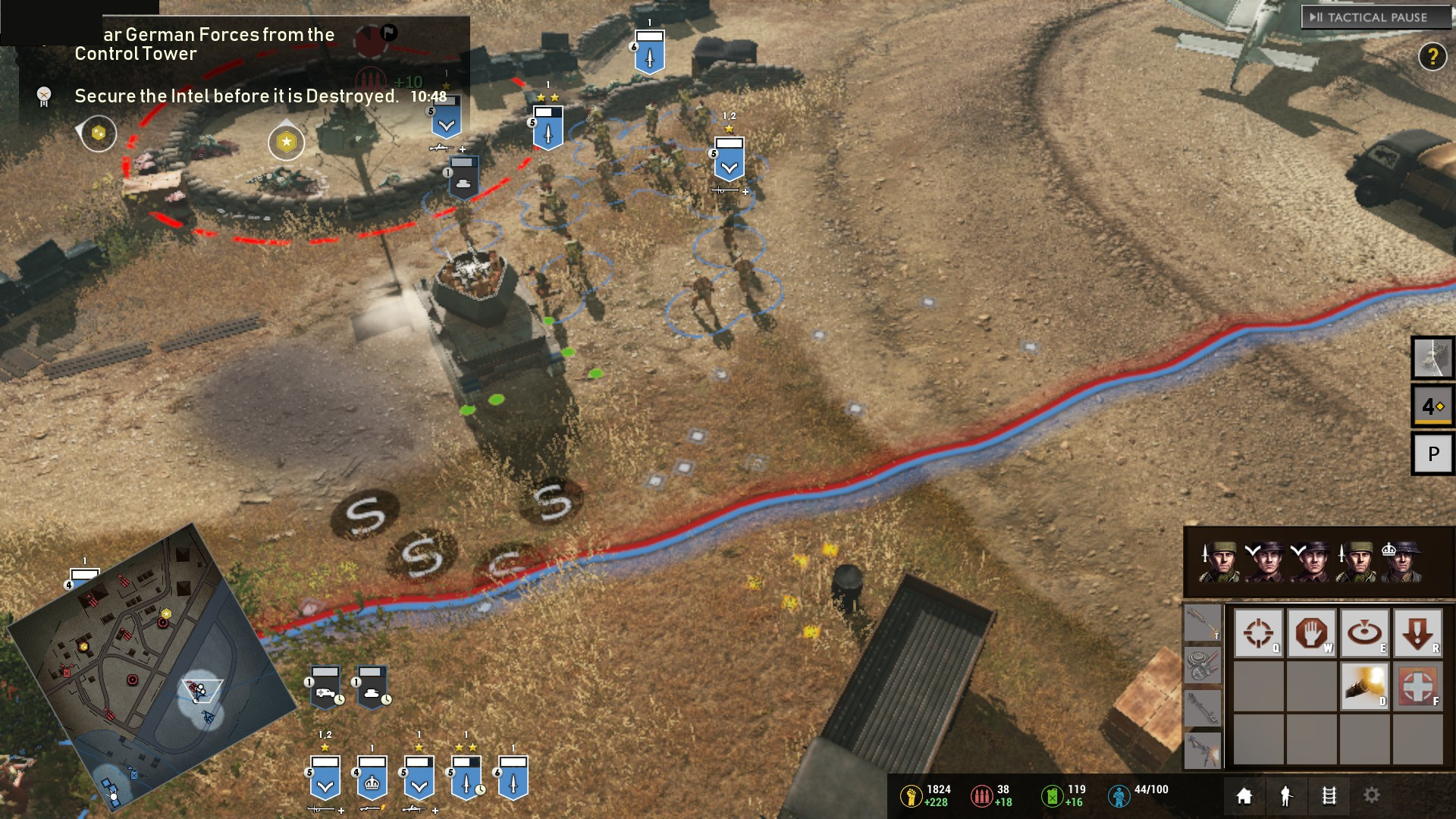
016.RTS-MAP.BUG.UI: Those symbols appear on the ground. with all the settings low.
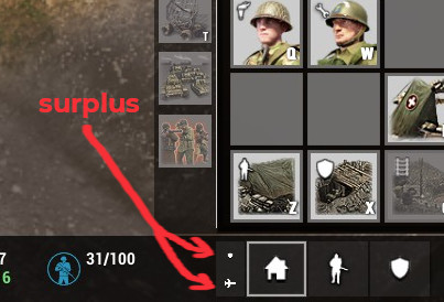
017.RTS-MAP. Surplus: All the abilities that those icons show, are surplus.
+Icons and code for commanders or abilities should be saved. Thumbnails icons, they are hard to see.
+And don't more abilities are really necessary. Save them for the commanders.
+With these abilities, who want commanders?
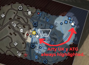
018.RTS-MAP.Arty and ATgun BRIT: always highlighted in minimap.
019.RTS-MAP.Building of units in environmental buildings: does not appear icon in shields line .
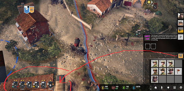
020.RTS-MAP.Building of units in environmental buildings, button: Don't can cancel build unit, dont have button cancel.
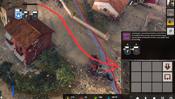
021.RTS-MAP.A History warnings: A history should be kept, at least of the last 15 warnings in the future tactical map.
022.RTS-MAP.bug.line of shields: Building of infantry units are higher than the shield line. It is curious that the tanks are correct.
023.RTS-MAP.pause letters: Mega-ultra-little letters of paused.
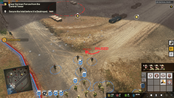
024.RTS-MAP.Duplicate groups: Units cannot be properly grouped. In coh2 this has never happened.
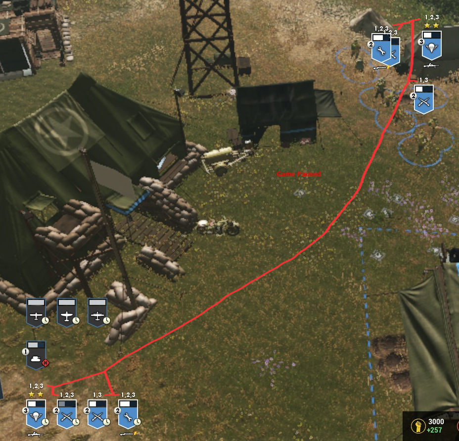
025.RTS-MAP.Dont real: The first impression, I do not like. It is better to use images from the game.
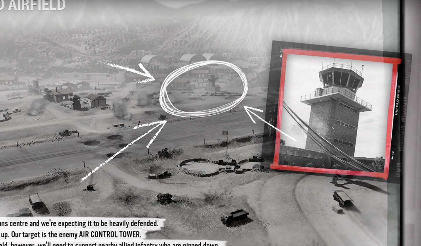
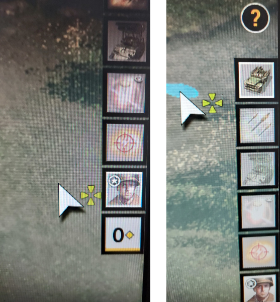
026.RTS-MAP. Reticle in call-in units and abilities:
+The jeep has a tiny reticule (it's like throwing a small grenade) and the SSF has no reticule.
+This looks like an unfinished game.
+The ideal is an empty circle, with the outside of the circle marked:
https://redirect.invidious.io/watch?v=pBSHKYbRPpg
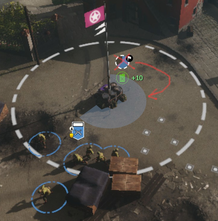
027.RTS-MAP.Capture 3d: Capture circle is the same as always. I hope you convince to Davit Littman for a Dev to make this change from 2d to 3D. Keep it as coh2 or new coh3?. We will see the decision, in millions of hours on twitch or playing.
028.Italian-MAP.Portrait of airplanes:
One of the advantages of coh3 is that you have air and naval units. But airplanes do not have their own portrait. It would be very cool if each plane appears its portrait as ships, or ground units.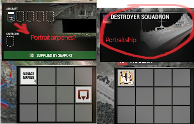
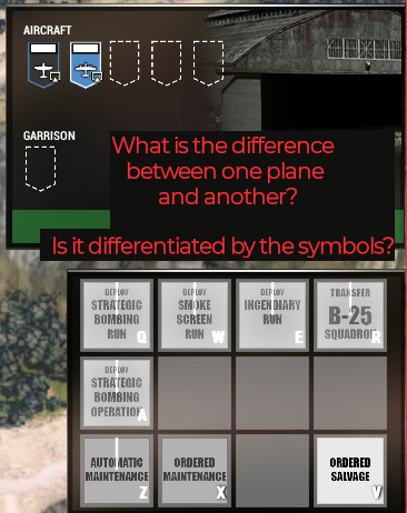
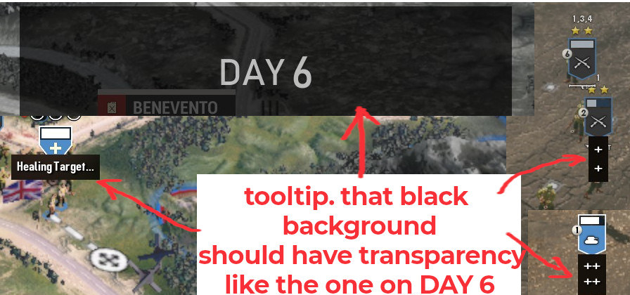
029.Italian-MAP.Tooltip.Transparency: Tooltip with Black background should have transparency like the one on DAY 6 (or any other).
Please note: Relic Ent.are still working on the game! It is still very early days in the development process, and while the build you will play is representative of the final game experience, just remember this is not final. This Pre-Alpha Preview is just an early look at what we have in store for the full single-player campaign. You may see or experience a bug here or there. …
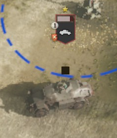
030.Italian-MAP.BUGTooltip.Enemy: Is using a ability, and that black box appears, reappears all the time (something like repair or healing).
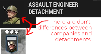
031.Italian-MAP.Front_portraits: There are don't differences between companies and detachments.
suggestion: companies with front portrait.
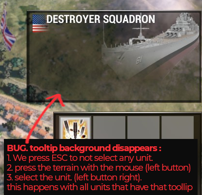
032.Italian-MAP.bug.tooltip background:
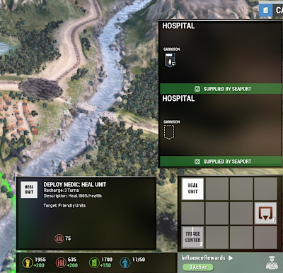
033.Italian-MAP.Bug.duplicate tooltip hospital:
+Duplicate tooltip hospital.
+Don't have portrait.
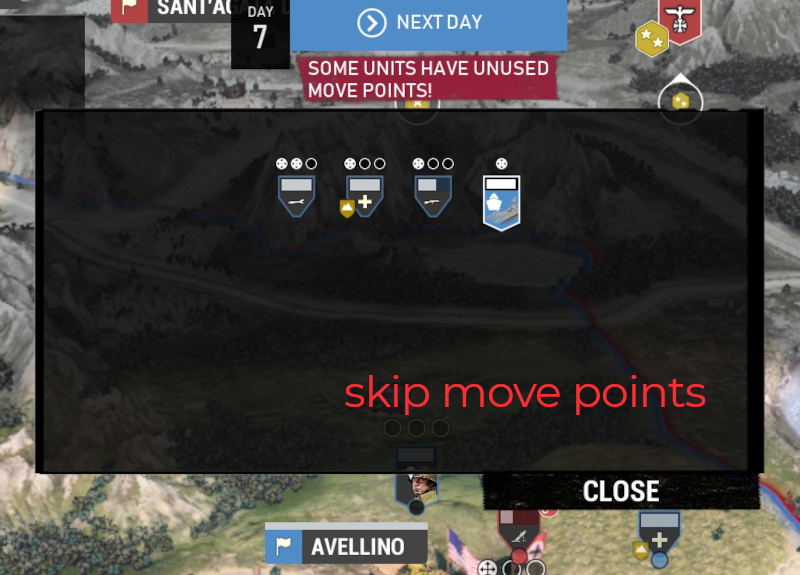
034.Italian-MAP.skip move points:
+Black background must be smaller or design differently. It's too big.
+the way of skip movements should be done differently.
+Datachments inside the company, they should spend their movement points.
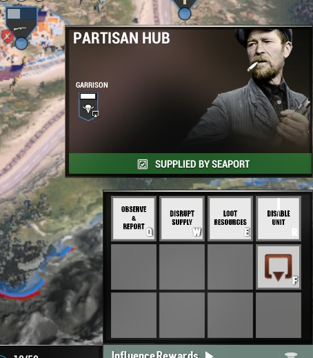
035.Italian-MAP. Change of role of partisan hub: no wololoooo, no spies or diplomatics.
+All coh3 units are active. Partisans don'move, don't fire. They are poor with the excellence of the rest of the game.
+ I still don't see the usefulness of the partisans. Are passive abilities and that in this case is something totally useless and lacking in emotion (oh, what I have a partisan city!, and don't move this unit!)
Suggestion: By capturing the city, a wounded company (company Partisan) would be released, which would appear directly in the port of Naples with 1 turn to heal wounds. And this unit would be the same for the Americans, British, Mix.
+they without flag, patisans would play RTS as:
if previously we have selected battle group US the company partisans play as US,
if previously we have selected battle group BRI the company partisans play as BRIT,
if previously we have selected battle group MIX the company partisans play RANDOM.
036.Italian-MAP. how many days?: the same day of purchase, if we put the cursor on top, nothing appears. The next day you see a bar, but it is not distinguishable. Suggestion: add a small tooltip of text: x days remaining.

037.Italian-MAP. Garrisoned units do not appear portraits (when we select):
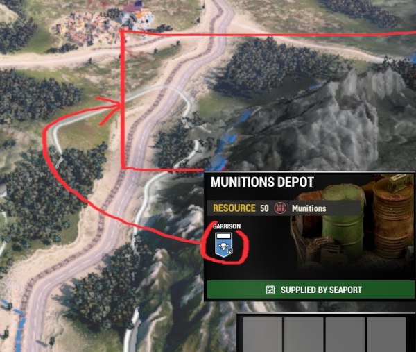
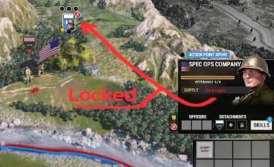
038.Italian-MAP.Locked: Without resources, there is no warning notice. suggestion: There should be a warning before this Locked occurs.
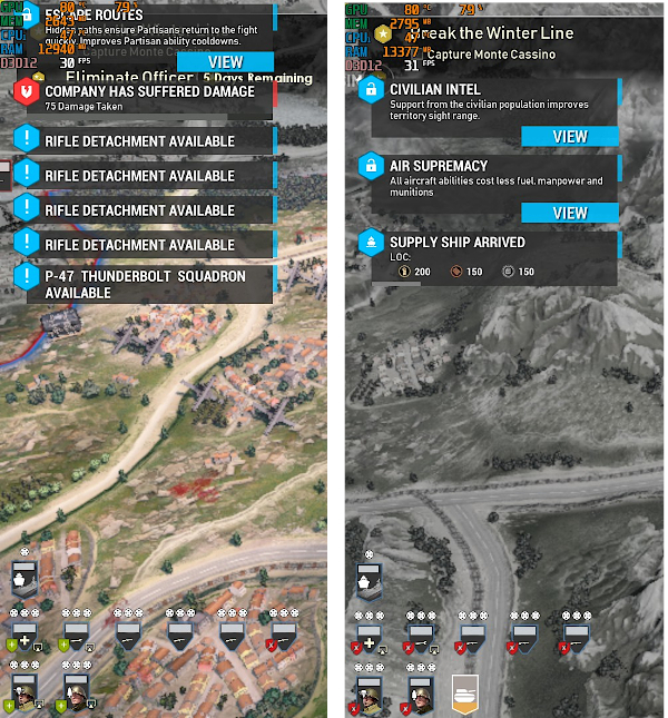
039.Italian-MAP. Wanings: Hide other signs, texts.
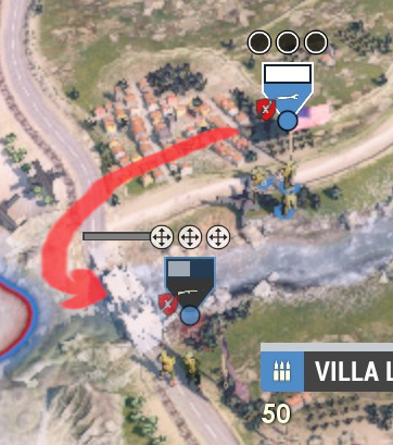
040.Italian-MAP. Bug. Do cant repair bridge:
+zapper cannot repair some bridges.
+zapper UI on bridge, does not appear the symbol to repair (as to attack if it is on the enemy)
041.Italian-MAP. Companies with colors: Colors are only used in MP. Here they would distinguish units. (blue, green, yellow, Light Blue).
.jpg)
042.Italian-MAP. Moviments points: Tooltip is big for fits the movement points perfectly.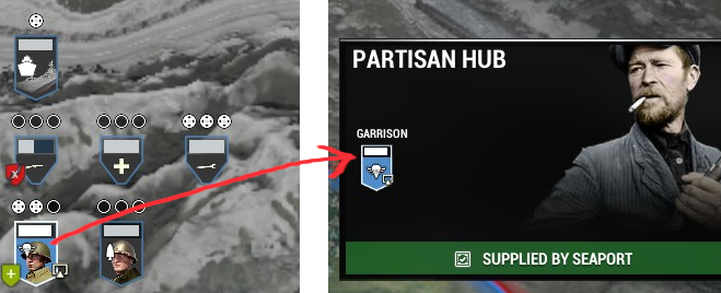
043.Italian-MAP. Add_titles_and_bar, like other units: What are the aircraft and seaports called?, Destroyer squadron is missing vet bar and supplies status
044.Italian-MAP. Reduce size:.if the tooltip is to be kept like this. the image (unit/emplacement) is smaller in height and there is a empty in all the tooltips of units and cities. Therefore the height size must be reduced.

045A_PREVIOUS. Italian-MAP. Reduce size previus to RTS: Size is correct. (Don't need the background. suggestions: pause the game y front the window)
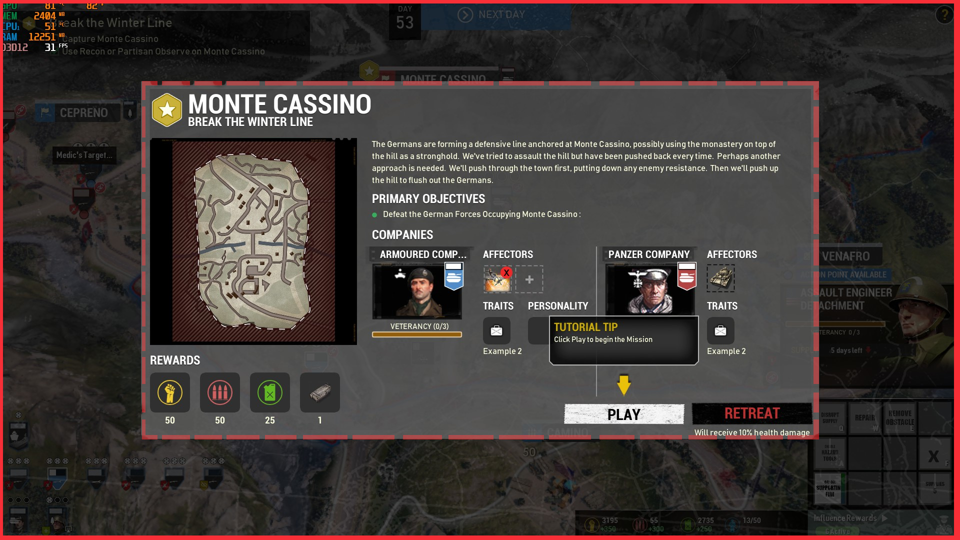
045B_LATER. Italian-MAP. Reduce size previus to RTS: Size incorrect, occupies and covers almost the entire screen. To display a few icons.
Suggestion: size should be as A_PREVIOUS. Large sizes to show contents are horrible. Except if a lot of content is gathered in a window with many tabs. (Supermarket as I mentioned below).
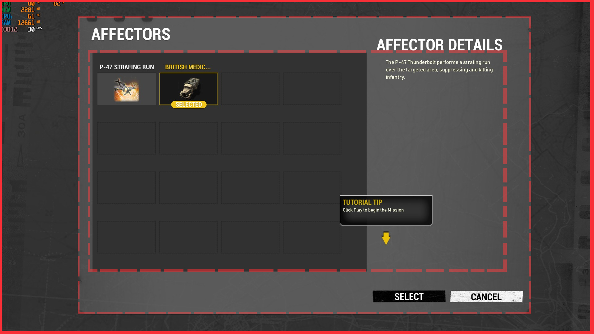
046.Italian-MAP.Cannot select items: Just by pressing select and re-entering, it appears selected.
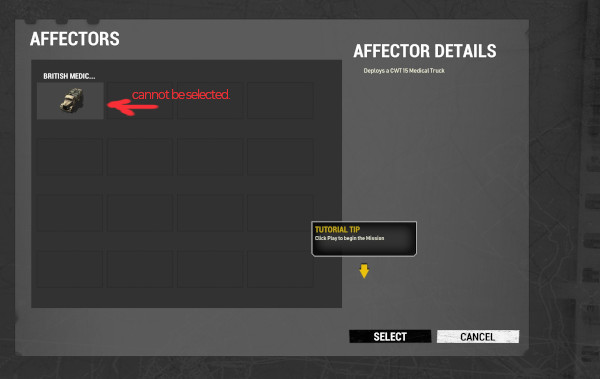
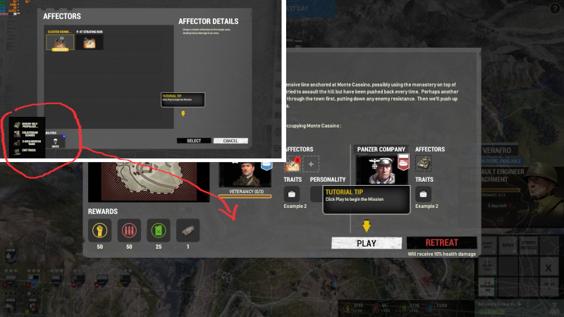
047.Italian-MAP.put forward, reserve units: Why are they in a secondary window? reserve units must be in the preview window.
048.Italian Campaign Map, Now alpha:
-mainfocus(company),mainfocus(company),
-secondaryfocus(ships),secondaryfocus(planes),secondaryfocus(littemarket),secondaryfocus(littleshop aka partisans hub)
suggestions :
+mainfocus(company). With two companies it more easier to play. With 1 company at the beginning of the game the campaign and was allowed to keep playing and achieving small goals as a 2nd commander.
Each plan does not allow you to purchase units from the other plan.
In mix if allowed but they are more expensive purchase units from the other plan.
For instance: In the early-game (5 or 6 turns) option to second company.
+Add more secondaryfocus, like creating AA (defend against airplane attacks ) or arty (that they can only shoot other cities) in the cities (or surroundings). This would give more diversity to the campaign.
repair the cities with AA or Arty, it would allow the user to create engineers to repair it, adding more seconds focus to the campaign.
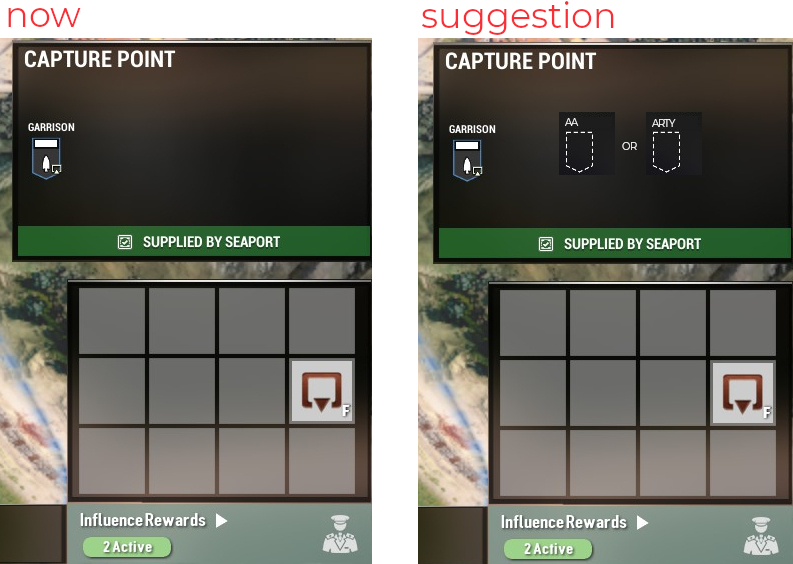
+secondaryfocus: mines should drop health and x turns of movement block
+secondaryfocus (AI path locks) would allow the user to create engineers to repair it.
+secondaryfocus (scorched earth) that the defeated enemy leaves the city, with scorched earth (city with low health).
+secondaryfocus (cities with low health) this produces less resource income. Would allow the user to create engineers to repair it. Less city health, resources are received proportional to that damage.
+secondaryfocus (find semi-destroyed enemy plane) (once in the entire campaign). When a defeated enemy leaves the city, user finds a semi-destroyed enemy plane.
It is sent to Naples, this x turns being repaired. User has an enemy plane.
+secondaryfocus (weaker line break with attacks behind IA parachutes lines) on isolated cities would allow the user to divertnunits to defend themselves.
+secondaryfocus:
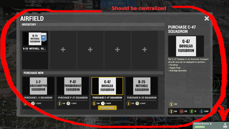
This screen should be centralized in a same window (Naples market). If they are created in Naples (the pieces arrive in a cargo ship), in this way we can move the aviation to another base.
Large screens must be justified with lots of icons and text. It makes no sense to have a single huge screen, to create airplanes.
Will each airport have its own window?
It is better that this screen is in the naples market with a tab. The supermarket window is justified because it has all the purchases.
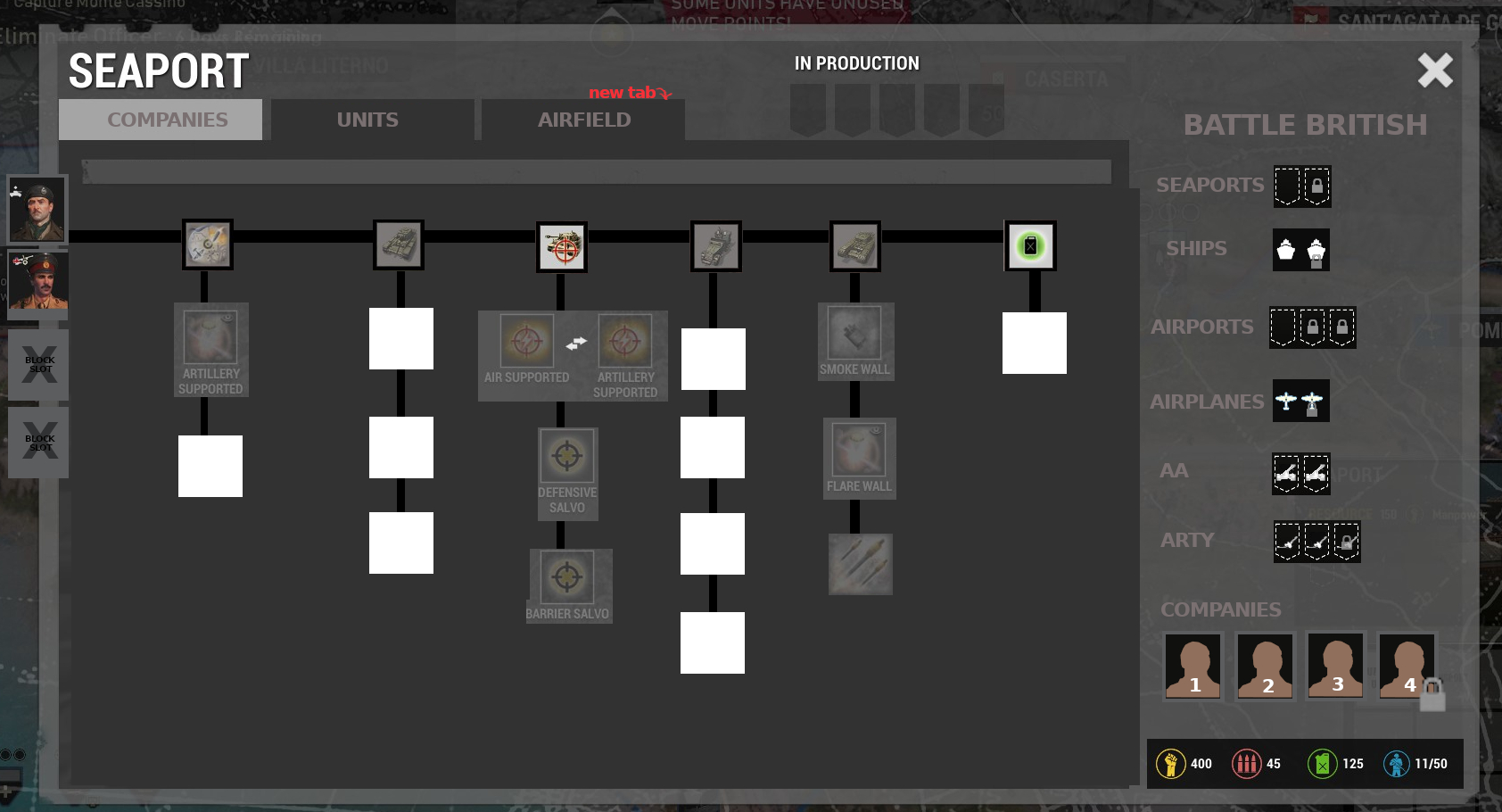
+secondaryfocus: revamp a great supermarket, centralizing all purchases in the same window.
-The small market of naples should be revamp a great supermarket.
-Add an aircrafts tab and thus be able to buy plans, etc.
-Best thing is that the place of "market" Naples should be the button lower right screen corner called "Influence rewards".
-Avoiding references, market, etc. It's better references to disembarkation, deployment, dispatch, call in, etc.
+secondaryfocus:
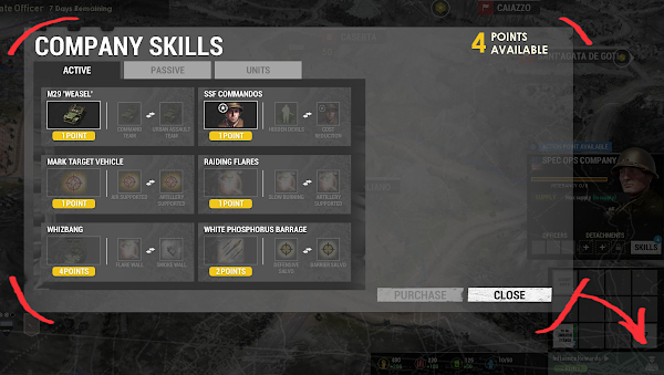
-Now the battle plan UK is the best because it comes with 2 ships. The Best. With 4 points you can buy the 4 call-in units.
The user will always buy/choose the best unit. Therefore it will vault to the best unit/ability.
The rest of items makes no sense. Why I need you more buy?
-As it is structured now, buying does not make sense having chosen battle plan at the beginning. Why buy call-in units and you don't buy anymore.
-There must be a company tree (with points earned by the company). Quit this system (Influence Rewards) is passive and complex, better save portraits for MP:
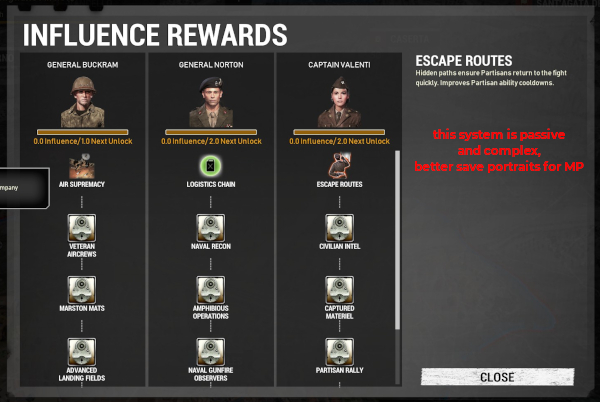
Company.skill centralize it to Naples market:
+secondaryfocus:
-The resources, MP, MU, FU is to buy companies, units, airplanes.
-At this time you can not cancel the purchase.
-New.Battle.Plan remodeled:
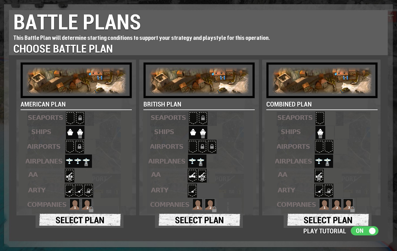
Suggestion: To differentiate the battle groups, each one must be unique, for example the BRIT has up to airport 3 max slots, 2 blocks and 1 free.
And the US group has other different slots and the mix too, in this way there are differences between the battle groups.
I don't see the need to add the bonuses:
USA: bonus stating munitions
BRI: bonus resources on all 3-day supply shipments
MIX: bonus staring manpower and partisan relations
-seapots,airpots,AA,Arty,companies: shows how many slots max, blocks, free you can have on each port being BRIT.
-ships,airplanes: shows how many units max, blocks, free you can have on each port being BRIT.
49.NEW DLC_. It would be nice to direct the landing:
The units do not matter, nor the number of units, just look at the concept in which this idea can be developed: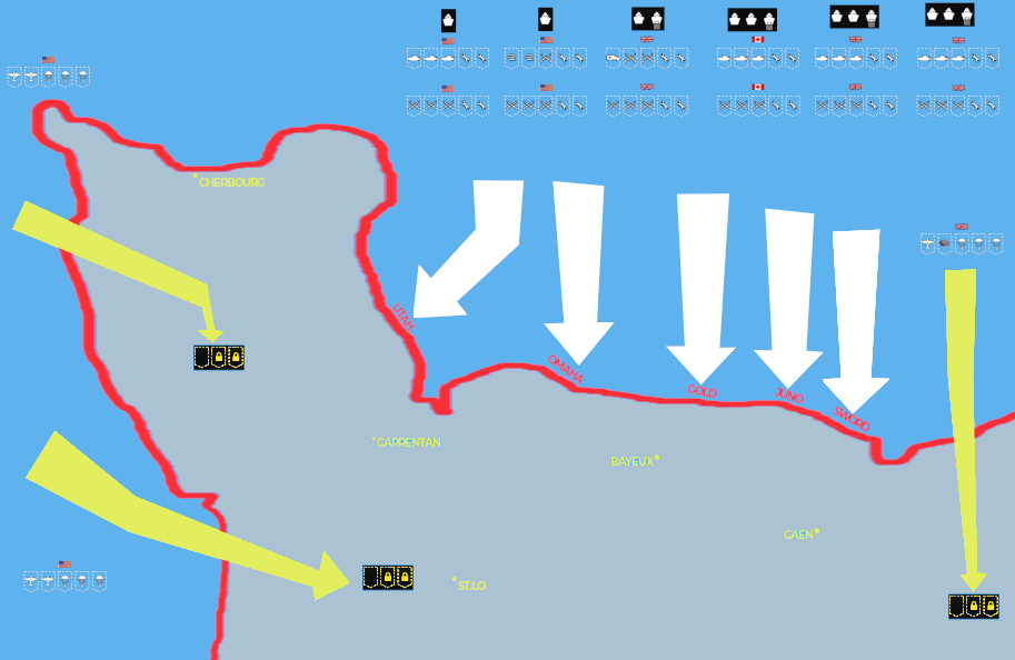 1.Choosing 1 group and assault the beaches (beaches with code names).+We could assault up to 6 groups and each one assaulting another beach.
+Once 3 groups (minimum) reach the beaches, we would have the option to disembark the second line of groups.
+This 2nd line has tanks, mgs, vehicles to defend the beach.
2.On the other hand, we can send another group composed of: planes (strafin-run), commandos, enginniers, supplies, etc.) to the assault (yellow zones)
Bye.
|
coh. coh. coh.
To learn more HTML/CSS, check out these tutorials!